Monthly progress(?) update #10 — Priorities
Yes, it's another meaningless update that brings nothing new to the .gba file for the actual demo. As long as I'm not banned from itch, I can make any posts that indicate that I'm alive and well and still think about AAMLC daily without any restrictions. Deal with it.
In terms of coding I didn't do anything this month. Well, except making a decision to rewrite most of the code mainly because the text output code, as evident by my GBA Jam 2022 entry — a game titled notenogram (which has AAMLC character cameos in the form of nonogram puzzle patterns), is still suffering from issues tied to font size and screen output specifics. Oh, and also thanks to the aforementioned game I have finally received some [negative] feedback regarding my custom Kvalligraphy font, which means I'll have to design another, reader-friendlier typeface for the game at some point, plus I may or may not disable downloads for Kvalligraphy in the future (though I've yet to receive any feedback from anyone who have actually used my font in their games).
In terms of visual presentation I began working on a new main visual (I think this is how it's called) for the game because that was the only thing I could do during the last couple of blackout days. Here's a work-in-progress image:
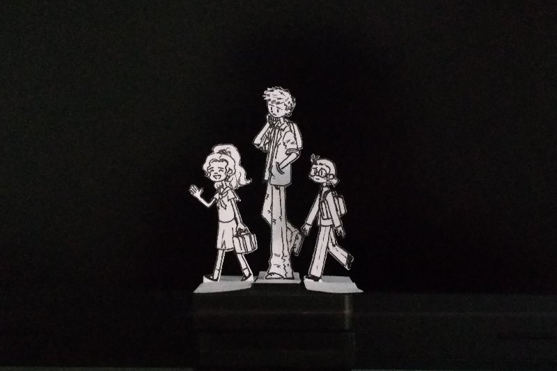
The analog look was for the most part inspired by the photo I took for notenogram's itch banner — during some time of the last week of jam I wasn't able to properly work on the game due to recently implemented nationwide daily power outages, so I made the decision to spend the development time without electricity on neat visual presentation — taking the banner photo, recording voiceover and drawing animated sprites on my 3DS. I actually have one more idea for a poster for AAMLC, but it will require some effort getting out of my Flipnote Studio 3D comfort zone to draw as it's quite complicated. By the way, the picture on this devlog's cover shows a test run of paper standees I made for character height references (canonically, Yuuji Sugeno is a very tall young man, standing at 195cm/6.4ft, and I had to keep that in mind while producing more paper standees of him and his fellow club members) and also to test out the look of a double-sided no-glue standee (I decided to opt for detailed edge cutting and using a glue stick in the end). No idea if I got the relative dimensions of a GBA SP right, though.
Speaking of character heights, since I'm not really occupied with game coding, figured I could try and make some devlogs with game's character introductions. It's an idea I've had for a very long time now, though I'm not sure if talking about my original characters will get anyone interested in a half-baked attempt at a visual novel about them. I do want to talk about their GBA game preferences and maybe even draw a bunch of funny comic strips, so stay tuned for that if you want, or leave a comment if you think you'd rather see more development notes instead.
That is all.
P.S. One of the characters (who also celebrates his birthday today, on November 26th!) already has a two-page intro from 2020, except it's mostly relevant to the franchise he belongs to as a fan character.
Comments
Log in with itch.io to leave a comment.
Hi! About your Kvalligraphy font, I thought it was cute the first time I saw it, though I agree some improvements would be highly appreciated (especially when you come to distinguish between groups of letters like L, I, lowercase-L on a small screen with probably no backlight).
If you don't mind asking, would I be allowed to use the "raw" version of the font to compile it into my own GBA font format, as I don't use neither GBStudio or butano? (I may use it in a possible future game) Thank you 😊
And don't forget you're doing great work so keep it up!
Oh hey, thanks so much for your nice and encouraging comment! 💚 (and what perfect timing, just as I was about to follow you for BugTris updates c':)
Really appreciate your detailed feedback on Kvalligraphy, I'll definitely try and experiment with the glyphs to make them look more recognizable and different from what I usually write on paper. I've actually wanted to update the variable width font versions since the release of notenogram, so I'm not planning to stop working on the font for now.
Feel free to go ahead and use the raw font version for your projects however you want, looking forward to anything you make with it!